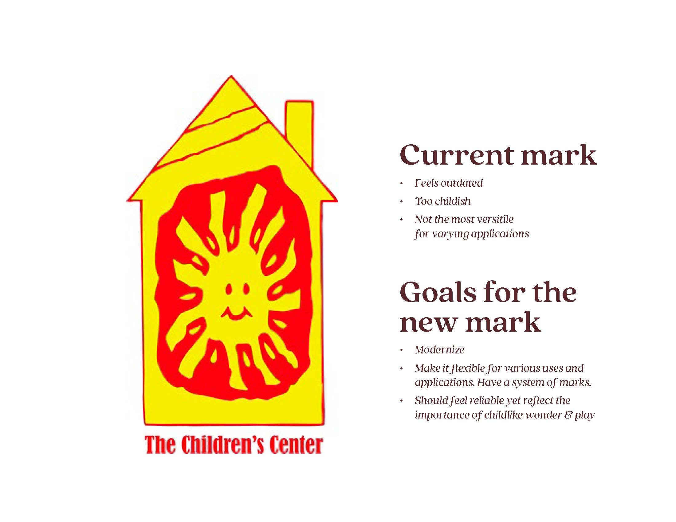
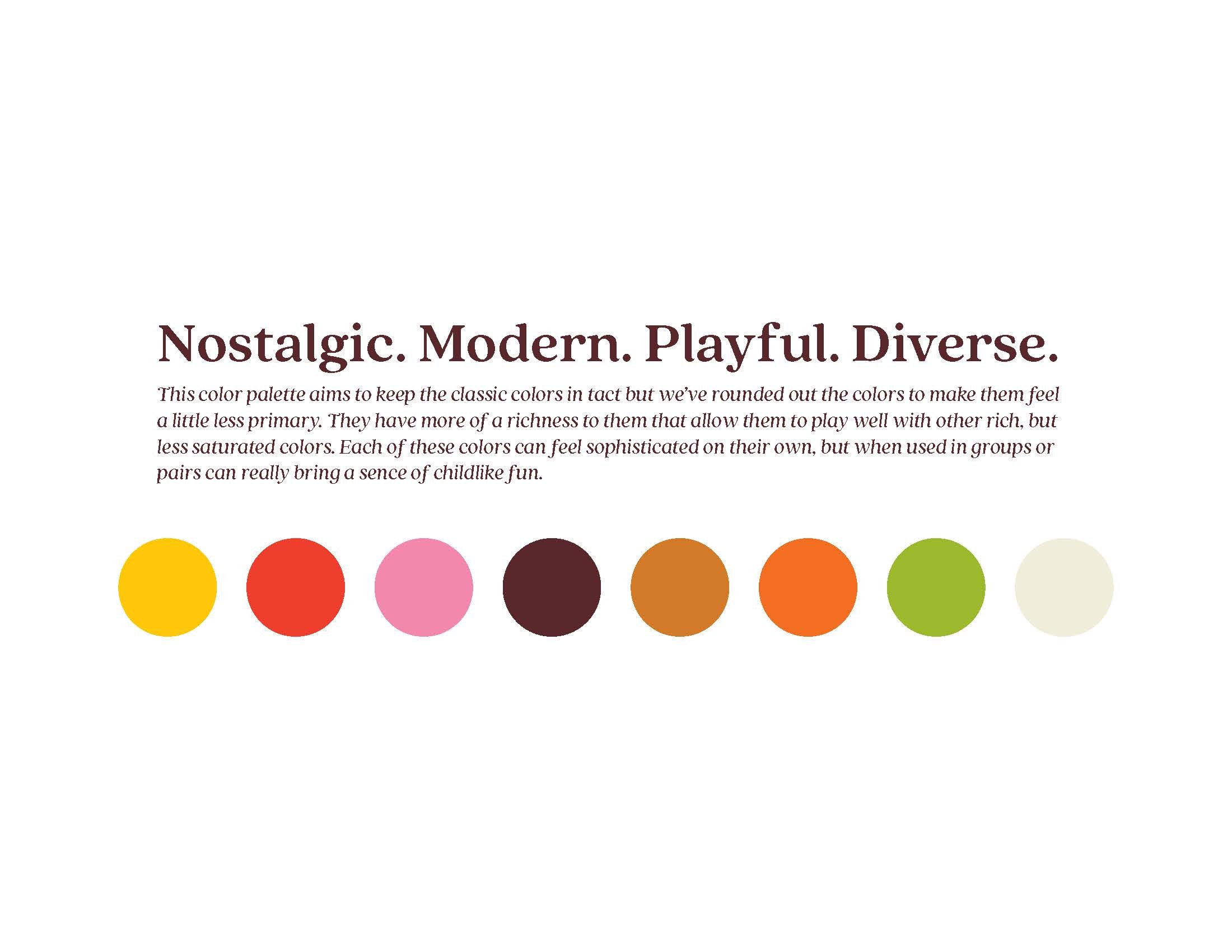
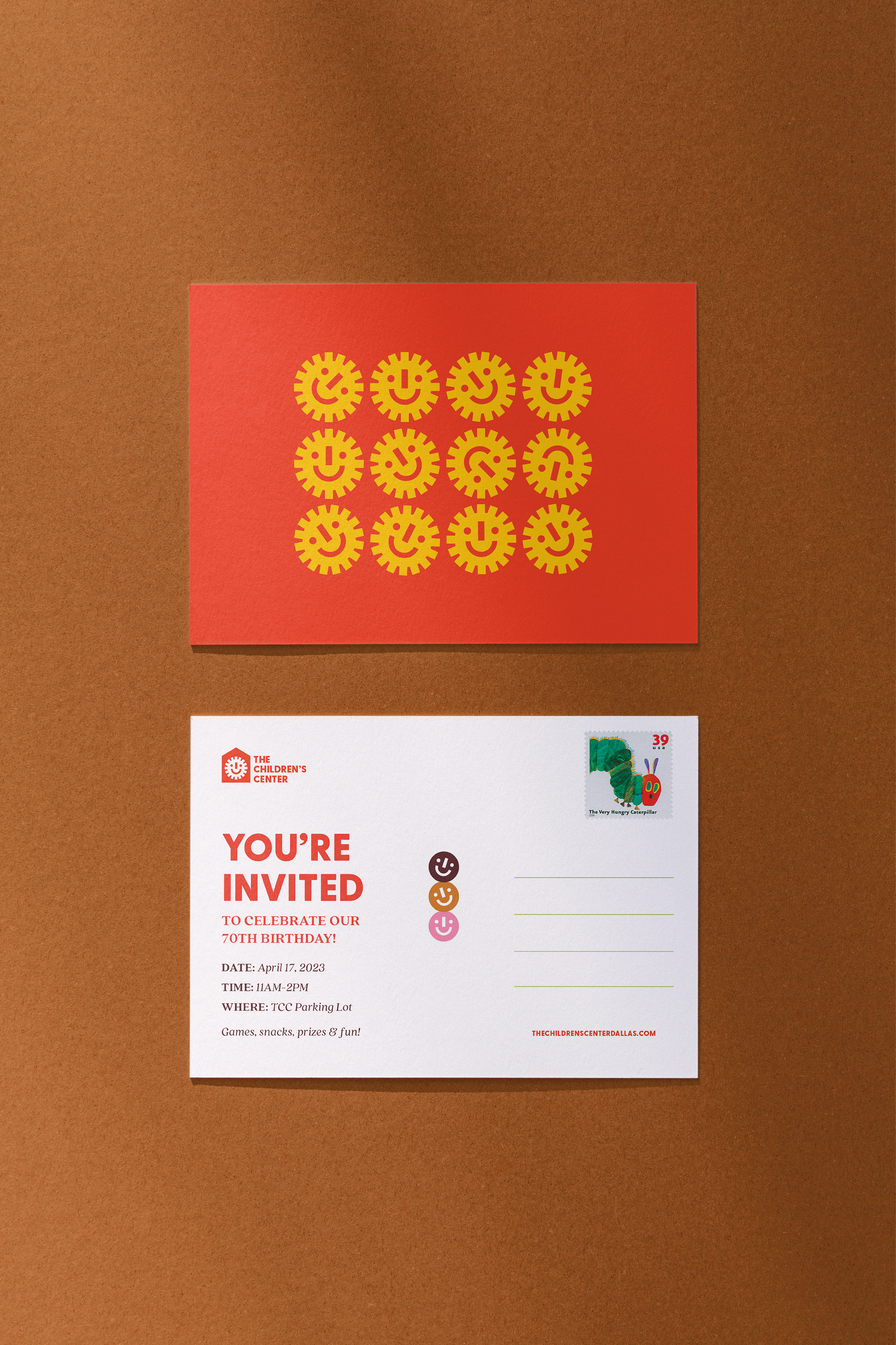
THE CHILDREN’S CENTER
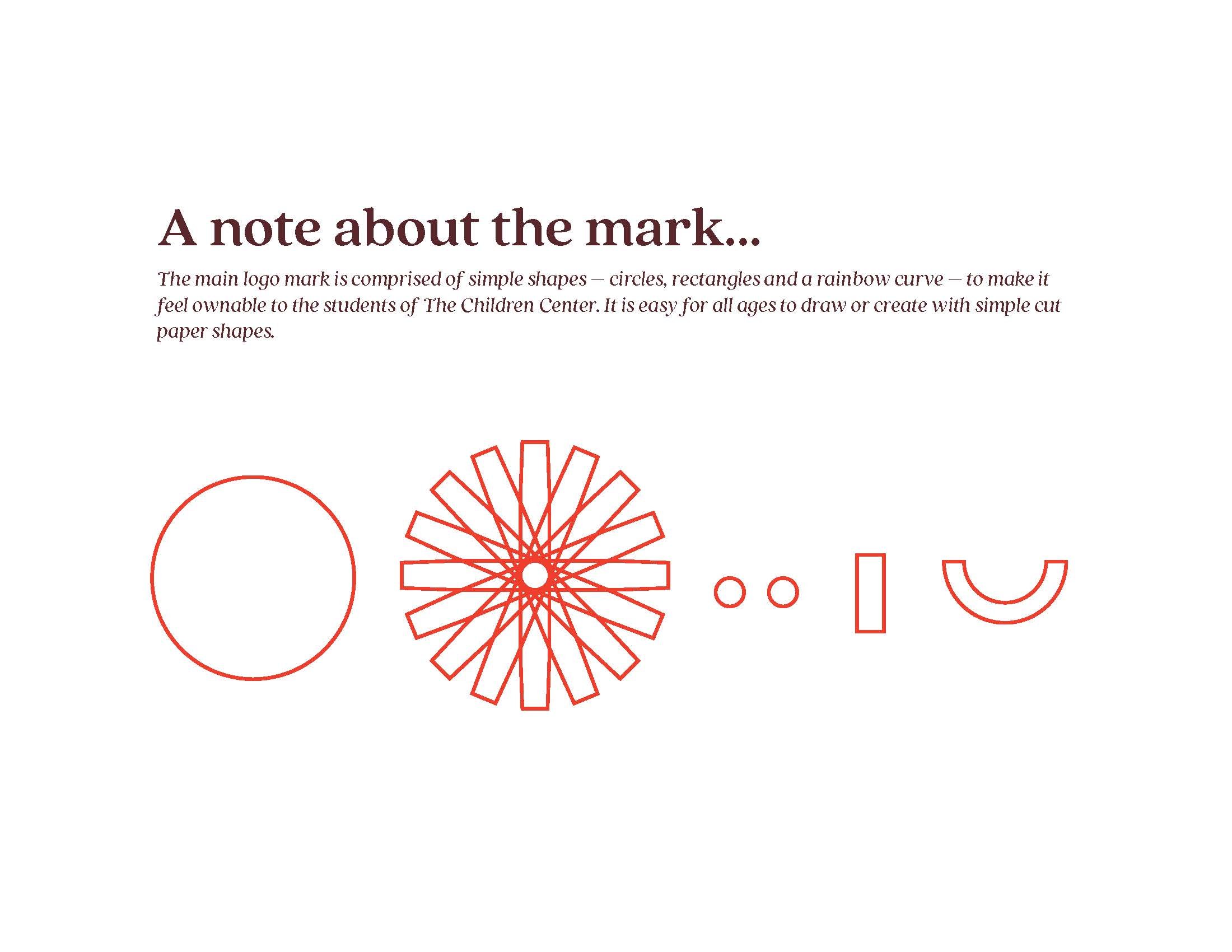
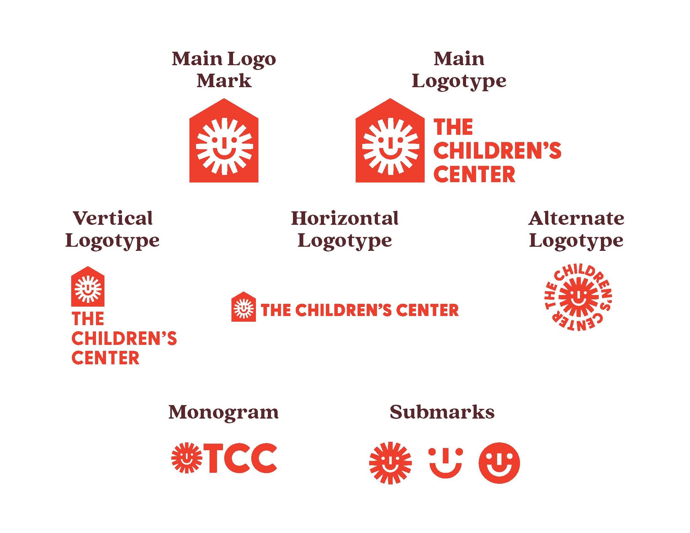
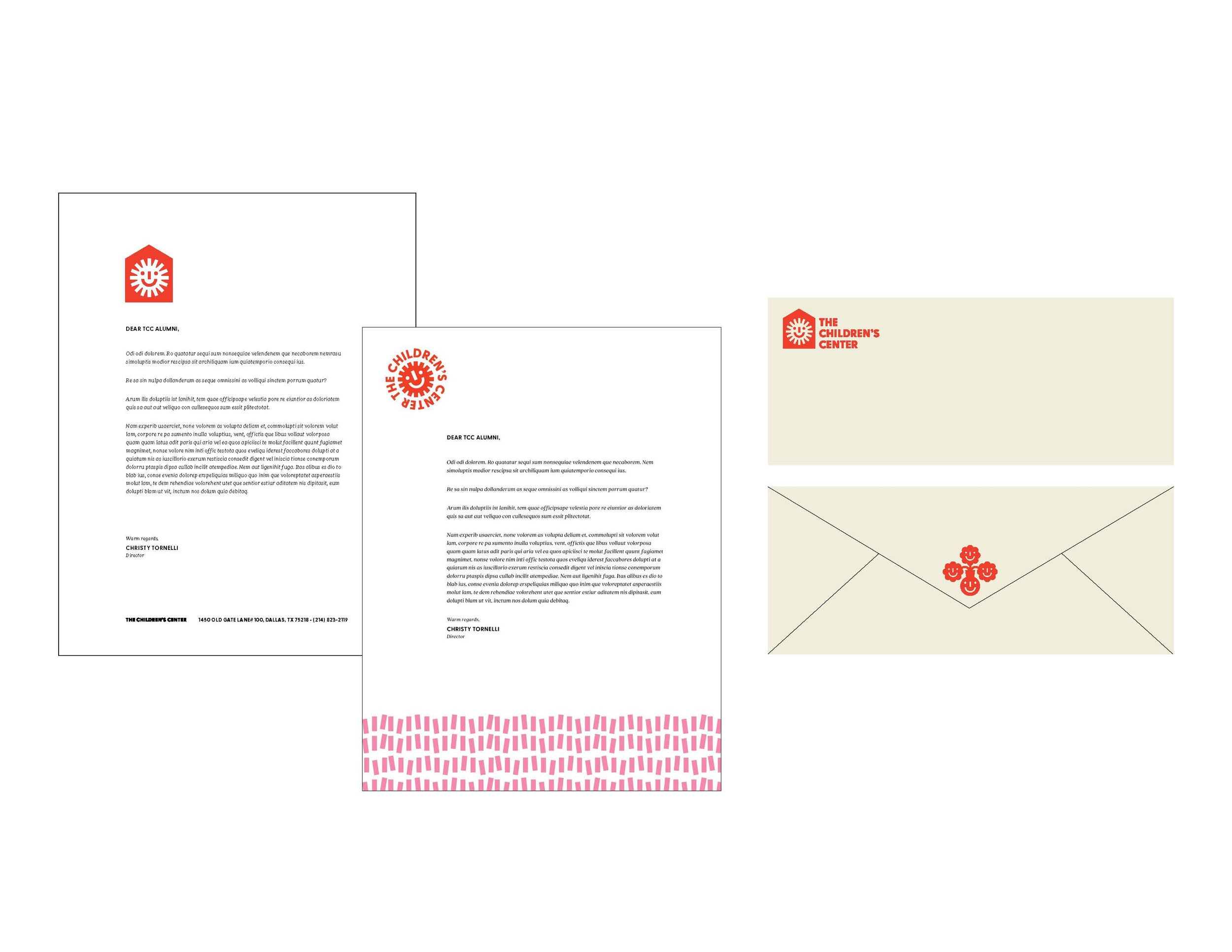
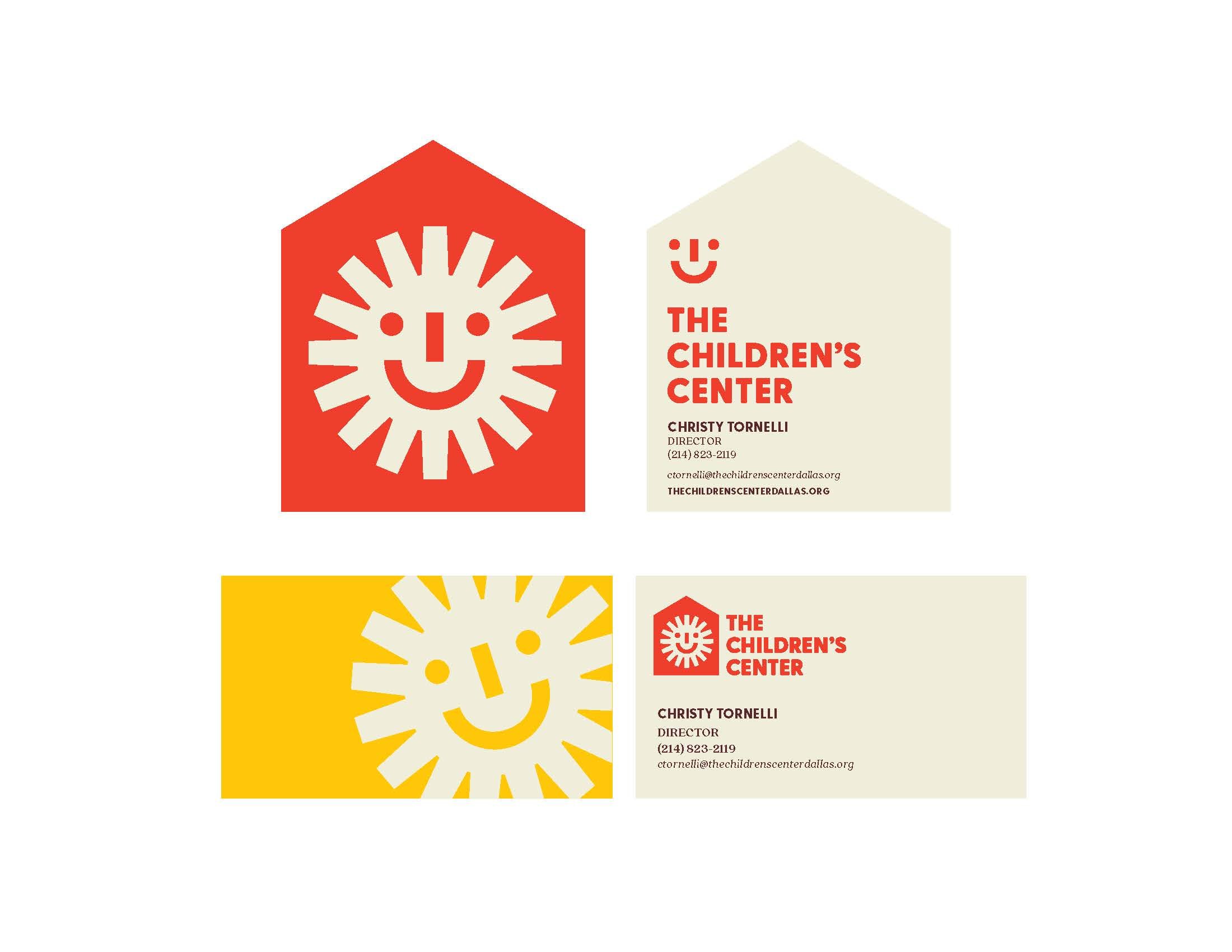
Near and dear to my heart is The Children’s Center – an East Dallas cornerstone for preschoolers and their families where my own daughter once walked the halls. You can imagine my excitement when they asked me to give them a brand refresh for their 70th anniversary! See below to swipe through the final brand presentation, including their previous and iconic mark – the yellow sun in the red house – that needed to be modernized & adapted for easier use.